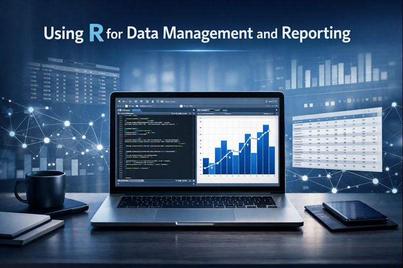
Using R for Data Management & Reporting
A 5-Weekend Instructor-Led Training for Public Health & Applied Research Professionals


Feb 07 – Mar 08, 2026
Live via Zoom
Using R for Data Management & Reporting (10-Day Weekend Program)
Duration: 10 Days (5 weekends)
Schedule: Saturdays & Sundays | 12:00–2:00 PM ET (New York Time)
Registration Closes: Feb 05, 2026
Format: Live via Zoom
Payment Options: Bank Transfer, Venmo, or Zelle accepted.
Course Fee: $250 (limited scholarships and variable pricing available based on Country of participant)
About the Training
This 5-weekend short course provides a practical introduction to data management using R, with a focus on preparing real-world datasets for analysis, reporting, and decision-making.
Participants will learn how to clean, transform, organize, validate, and document data using reproducible workflows commonly used in public health and applied research.
- Live, instructor-led sessions
- Hands-on labs & assignments
- Reproducible workflows
- Final mini-project
- Built-in datasets (bring your own later)
Who Should Register
Designed for advanced undergraduates, graduate students, faculty, and applied researchers aiming to apply ML in their work.
- Basic R and statistics familiarity
- No prior ML experience required
- Conceptual, not purely mathematical approach
Learning Objectives
Apply ML workflows in R
Big data & data lakes
Implement feature engineering
Communicate findings via R Markdown or Shiny
Weekly Breakdown
- Overview of ML concepts and workflow
- Data types, features, and labels
- Model training vs testing process
- Using real datasets for exploration (e.g., Palmer Penguins)
- Practical examples in R showing how caret and tidymodels integrate
- Handling missing values, scaling, and encoding
- Feature normalization using both caret and tidymodels
- Real dataset: Heart Disease
- Assignment: create and compare preprocessing pipelines
- Linear and multiple regression models
- Regularization (Ridge, Lasso, Elastic Net)
- Evaluation metrics (RMSE, MAE, R²)
Implementation using both caret and tidymodels
- Logistic Regression & KNN classifiers
- Model performance metrics: Accuracy, ROC, AUC, F1
- Implementation with both caret and tidymodels
Visualization with ggplot2
- Decision Trees, Random Forests, and Boosting (XGBoost)
- Bagging vs Boosting theory and implementation
- Performance evaluation and tuning
- Bonus: Feature importance visualization using vip and DALEX
- K-Means and Hierarchical Clustering
- PCA for dimensionality reduction and visualization
- Interpreting clusters and components
- Practice using cluster, factoextra, and ggplot2
- K-Means and Hierarchical Clustering
- PCA for dimensionality reduction and visualization
- Interpreting clusters and components
- Practice using cluster, factoextra, and ggplot2
Each week includes:
🎓 Lecture slides (PowerPoint)
💻 R lab exercises (caret + tidymodels)
📊 Real open datasets
Computing & Tools
All analyses are done in R using packages like caret, tidymodels, ggplot2, and DALEX.
All example files and syntax are downloadable from the course portal.